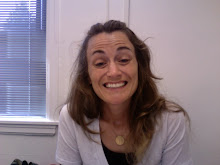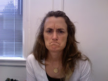
ok so i took some criticism into mind. i moved the text to the bottom third of the page and flushed left. and added an enlarged strip of the cover. to help it be more readable. i also removed all curtains from each pic and kept everything very simple. thanks for the comments guys!


2 comments:
i think the changes work but you are missing something. One more image of some kind.
You could almost put these photos in a row or column. I think it looks really cool that they are sort of all "right-justified" though. This composition reads, to me, like a page in a picture book or scrapbook. I think that for the sake of the assignment, you don't need to do this, but you could really strengthen the visual idea that you are working with by making this a page in a short book about your moms pregnancy with you. I don't know if I am explaining it very well, but I feel like this is one of those composition is stronger when it is one in a series-- one page in many.
I'd play more with the pattern too.
This is cool, Amy.
Post a Comment