Thursday, December 4, 2008
final project
ok so I tried to upload my video and 2 1/2 hrs later it was not uploaded!!!!! argh. anyway so my final project for technology in art education was a video. i interviewed each of the students on their views and expectations of the art education major. the editing was a little rough. if i were to make a movie again i would definitely use a microphone and any sound equipment to alleviate any distraction. i like the improv style and the natural responses of the interviewees. overall, i think the project was successful, and gained some interesting insight into each of my fellow classmates. thanks guys! have a great break!
Monday, December 1, 2008
final project screen shots


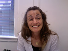
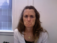
These are some screen shots of the final project. The name was the transition i created for each classmate in photoshop, the pixellated screen was a request by the interviewee and 2 pics of me the beginning and the end. my flash drive was erased because i pulled it out before it was completely ejected, so i wen tover to the G2G mobile lab and they helped me recover some of my flash drive. AHHHHHHHH!!!!!!!! but all is well and the show will go on.
Sunday, November 30, 2008
final project 11/30 update
so i finished my movie last tuesday before the thanksgiving break. i saved it to my flash drive and now it is saying there is nothing in the file. the file is saved on the desktop at school and hopefully will be there on tuesday for the final crit. i am also hoping my sisters dinosaur computer is just being quirky and once i get home i will be able to open the file and post my screen shots to the blog. overall the movie was a success, thank you class once again for your participation. imovie is fun, but i think for any other in depth project i do, movie wise, i will look into other programs or do most of the editing myself. imovie is limiting, i was able to add some special effects and sound, but not exactly what i wanted to do. the transition option on editing is a pain because anytime you add a transition it cuts the movie to make room for the transition. the solve that problem i made my own transitions with photoshop and saved as jpegs and added as clips to imovie and inserted to the movie. this allowed my recorded clips to remain accurate with time and sound. also adding subtitles is tricky too, it does the same thing, cuts the clips to accommodate for the info inserted, which i also solved with my transitions, as well, so i killed 2 birds with one stone. i used imovie for my demonstration video and learned a little, this time around more experience was gained so it was a little easier to use, but still overall pretty limiting. i added some fun quirky little nuances so i hope ultimately all will enjoy. the video is @ 20 mins long, so i am also hoping to present first to get it out of the way. hope all had a good holiday. see everyone on tues. & good luck!
Thursday, November 20, 2008
final project screen shots


screen shots of my movie. 2 interviews were done with my camera and 3 have been completed since with the digital recorder. so far the interviews have been improv"ish" and i am happy with the results. i plan to add music, to the beginning and end. i will also contribute my thoughts and feelings to the video. at the end. basically its turned into a research project and my findings have been interesting so far.
Tuesday, November 11, 2008
1st Blog Post Final Project


this is my first post to my blog for my final project. i have had consent forms signed by all, but 2 classmates. i checked out the camera from the equipment room and am now (i think) charging the battery. the camera i checked out is the older of the 2 we could choose from and only works from a battery pack, the battery pack apparently doesn't hold much power and takes a long time to charge. the light is green on the charger which made me think it was charged, then as i tried to record the camera was telling me the battery was dead. so i am waiting to see if the light turns red for go instead of green. if this doesn't work i will try to use the newer camera or use my own digital camera to record the video. i am hoping to use a video camera, we shall see. i will begin to record classmates this afternoon and thursday and go from there.
Tuesday, November 4, 2008
Thursday, October 23, 2008
analyzed ad

I tend to lean the “less is more” attitude when it comes to anything, except money of course. I worked at the agency in New York that designed these pro bono ads for gun control. I was always amazed at the impact they had on me. This one in particular is very clever and gets the point across simply.
Reading the word ” JAIL” centered on the white space creates an immediate interest and automatically engages the viewer. The “JAI” as large simple black type is appropriate because when you get to the “L” it is represented by the menacing handgun. This is a simple yet, ingenious solution to what the ad is communicating. The handgun, also, creates an uncomfortable feeling, which for me strikes my curiosity. Though it seems obvious that guns and jail go together I think it causes the consumer to wonder, “what EXACTLY does this mean? “of course people who use them are bad and go to jail.” Thus, the text that follows explains it simply, “caught with an illegal gun go to jail for
3 ½ years.” The blocked text of grey tone with GUNS = PRISON in white type gets the point right across.
This entire ad has a lot of white space, but none of it trapped. There is clearly no need for fancy or crazy use of type, as the “L” for JAIL creates enough impact. The “GUNS = PRISON” is the logo for the campaign which makes it easy to identify. I have also attached another ad that has impact visually with out the use of type for the same campaign.


Tuesday, October 21, 2008
SHARK ART SHOW AD

This is my ad for my art show. Though it doesn't literally depict my logo, it goes along with the shark theme. The points of the triangular teeth draw you in to the center of the sharks mouth as to the most important information, what the event is. The font for "Art Sharks 3rd Annual..." was outlined, enlarged, and "tweaked" to give it an edgy "shark bite" look. The black right and left edges are two arcs. The bottom of the mouth is a distorted semi-circle. I drew the teeth my self with the paint tool, for realism.
The additional info at the bottom is non-pertinent information. The font was reduced and to the point with so no real attention was drawn to it, but it keeps your eyes reading once viewing the main content of information as the text is flush left. The entire ad has a basic black border all the way around the ad space to have a cohesive well defined space.
Monday, October 13, 2008
FINISHED LOGO

Ok so it seems a little cheesy, but it's for a middle school. i used the fin as the "A" and and added a waterish element for color......the fonts are the same, for shoal lake and middle school, i just scaled the middle school part to make it a little bigger, a whole different font and whole different font size did not look right. overall i like the idea, i used the warp tool as my watery wavyness. The fins were the arc and line tool with a color fill and some transform "bring to front" for the type. I reflected the fin in "lake" for consistency. my first attempts (in the sketch post) i tried the swirl tool for the water, and i liked the effect, but it seemed a little too complicated for a middle school logo. this i feel is simple and can thus be expanded on, as you will see in the upcoming newspaper ad assignment. also, this is a good way to keep it simple stupid. who doesn't know a shark fin.
logo ideas


The four pics here, 3 sketches and one attempted in illustrator, are my ideas for the school logo. I thought about using an actual shark as in the original piece that inspired me, but it seemed too trite. so i tried a more simple approach as you will see in my final piece.
Thursday, October 9, 2008

Wednesday, October 8, 2008

Tuesday, October 7, 2008
apples illustrator

ok so this was my attempt at a still life fruit bowl, i will try harder next time. thank gpd for 2-9 lab hrs on wed.
Thursday, October 2, 2008
improved (hopefully) self portrait

ok so i took some criticism into mind. i moved the text to the bottom third of the page and flushed left. and added an enlarged strip of the cover. to help it be more readable. i also removed all curtains from each pic and kept everything very simple. thanks for the comments guys!
Wednesday, October 1, 2008
PHOTO ESSAY


this is my photo essay from before....again another late project. so anyway its about washing my bed and how happy it makes me. a clean bed is one of the the best and simplest things in the world. i took the idea of nature v. technology approach for my essay. though convenient, the washing machine is so ugly. in the first and last photos are my bed in "proper" settings dirty and clean. the first one shows my bed in a dump setting, the 2nd is a painting of washing clothes by a river, with my electric machine incorporated, next is my dryer "hanging" from a clothes line, and finally my clean bed in a field of beautiful fresh flowers.
working self portrait

this was an idea i was going with for my self portrait, i tried to incorporate my face, but just wasn't feeling it. i was going for a theme that represented aging, these are photos of my mother when she was pregnant with me....her 7th and final child. as i continue to get older seeing that i am getting chin hairs and used my actual hair and cut and pasted it to my chin. i tried some coloring of the eyes for a bluer effect, the 70's stereo system i thought could make a cool repetitive element, but just wasn't feeling it, so i finally ended with the photo below. ENJOY!
MY FINAL SELF PORTRAIT

this is my final self portrait.....i tried my face, as you will see in my other posts, but i thought this was a good representation of me. i am the youngest of seven and as you can see my mother could never stay awake when she was pregnant with me, i carry her love for naping........sans kids. i was born in the 70's so the color scheme is disgusting. i scanned all four pics using our in class scanner. the pattern from the couch cover was used to create the pattern for the background using the pixellated option. i cropped the photos and erased some of the edges to give it better flow and erased some areas in the photos to include the patterned background. repetition with the pattern is obvious, using the pattern from the couch to the pattern for the background. i numbered each photo representing her progression to sleep. i didn't change the colors at all because i think the representation was perfect. after looking at the print out tho, i feel i could have adjusted the numbers so the brown color i used would have been consistent once printed and to add a little more contrast. i printed at the graphics lab in pollack rm 217. the printers have a default setting for the type of paper i used so i did not have to make sure it printed in cmyk. my mother will probably kill me for using these photos, but i couldn't resist.
Tuesday, September 23, 2008
ok so real answer for question on handout
12 X 20 is the answer basically 4x the size of the original scanned image.
my sketch

so this is my self portrait and i dont care for it very much.....oh well. using the tablet in class and getting very frustrated as i often do. i am glad there are lab hours. weeeeee.
Thursday, September 18, 2008
shared rendered ball

my teacher and i rendered this ball on our first tablet day he did most of the rendering the odd marks are from me and the shading......

Friday, September 5, 2008
photo of neighbor gina

so this pic is the one i took of my class neighbor gina, with her digital camera, and my first photoshop attempt. i chose the grayscale version vs. the rgb. i multiplied a yellow color over her shirt, in order to appear as a shade and not a whole color block, as well as, a pink shade over her lips. the photo was cropped originally centered she's off to the right and added an oh so cool highway background. the instructor helped me cut and paste the background and then enlarge behind her as a seperate layer, holding down the shift key allowed me to fit the photo into the space. i used a lot of the magnetic lasso tool. i believe this is a total of 4 layers. her face, the shirt, the lips, then the background. i used the eraser and paint tool to enhance her lips, which is kind of sloppy. it was a frustrating experience, but i'd like t think i learned a little of the program. the options are endless and look forward to at least becoming a little more knowledgeable with the program. so much manipulation so little time.
Tuesday, September 2, 2008
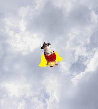
My hero ellie
My super hero is based on my dog and how important she is to me. She is my hero, I rescued her from a shelter about four years ago and have been through many trials and tribulations.
Ellie with her perfectly placed black and white spots has remained my true friend. She gets along with everyone and makes most people happy. Though, she does not fly, it is truly her tail that makes most people smile. I have discovered it is the simple things in life that matter and her happines and inconditional love keep me going day to day.
Heroism comes in many forms and mine ismy four-legged friend. I have a cat too, that i love, but she would be considered Ellie's arch enemy. I have to say though I am on both of their sides and have equal affection and admiration for what they have to offer evil or good.
Thursday, August 28, 2008

Tuesday, August 26, 2008
Subscribe to:
Posts (Atom)